| It should be mentioned before looking at these images that the most integral and, in my opinion, most impressive item in my portfolio is this site itself. I made this page entirely on Dreamweaver 2 using Photoshop and Illustrator for the graphics in a period of only about three weeks. I have made another page using Pagemill in the past, though I feel that this one is far superior. There are several items in my portfolio that cannot be on this page because, as is the case with much of my first year work, the files have been lost or the files just cannot be posted, as is the case with a piece I made in Director or several Quark layouts. Having said that, my favorite pieces are the first two; from my second year in Graphic Arts. All of the rest could be done much better now. But, this just illustrates to me how much I have learned since my first year. |
|
Second
|
Year
|
||
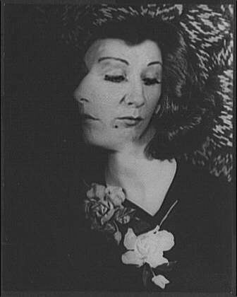 |
This image was made in Photoshop by blending together two photos of the same woman from different angles. Using a layer mask, I made the blend appear nearly seamless. |
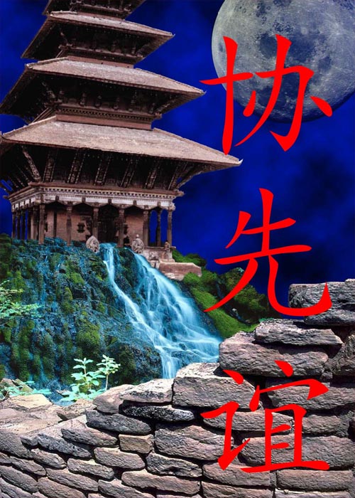 |
This image was made in Photoshop, using several layer masks. I blended together photos of the temple, the waterfall, the stone wall and the moon. I did some close work blending together the temple and the waterfall. I'm pretty proud of this piece-it turned out just like I wanted it. |
|
First
|
Year | ||
 |
This image was one of my first projects. In Photoshop, I copied a photo and put it in different places. It seemed pretty cool at the time, but as I look back on it now I think it turned out bad. I used to look like a dork. |  |
Another one of my first projects. I used Photoshop to change the colors in parts of the image, then displace them. Although I looked like a dork, it's harder to tell and the colors make it "feel" different. Overall, I think it turned out OK. |
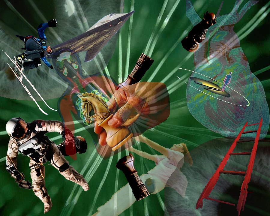 |
This collage was made in Photoshop. It turned out alright, but I wish the colors could have matched better. The transparent layers work together alright, but the individual photos don't really have anything in common. |
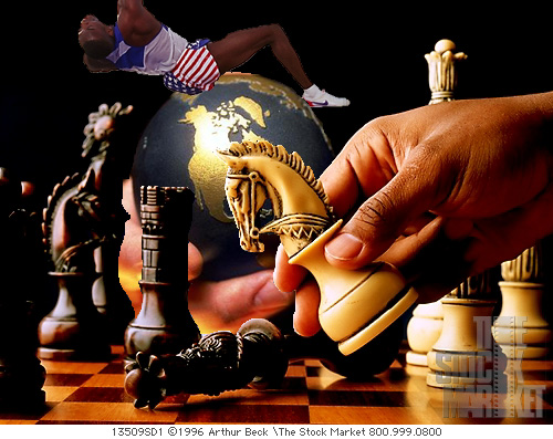 |
This collage was, of course, made in Photoshop. It was made very early in the year, so I was still learning the program. It turned out fine, but I have some gripes. The globe looks OK but the man is too out of place. A poor photo choice perhaps. |
|
|
This is a piece that I made in Illustrator. The assignment was to copy a photo as close as possible, striving for maximum realism. I'm happy with it. Even looking back on it now, I'm suprised by the realism I achieved at such an early assignment. |
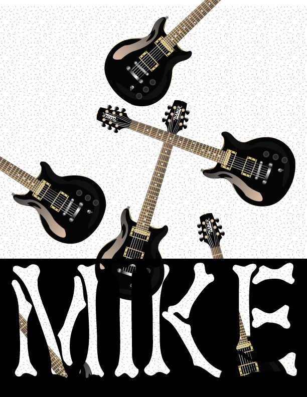 |
This is a matchbox cover assembled in Illustrator using by photo-realistic guitar from a previous assignment. We were just to copy an existing cover and alter it. So, I replaced what were initially matches with guitars. Not too bad, but my name looks stupid. |
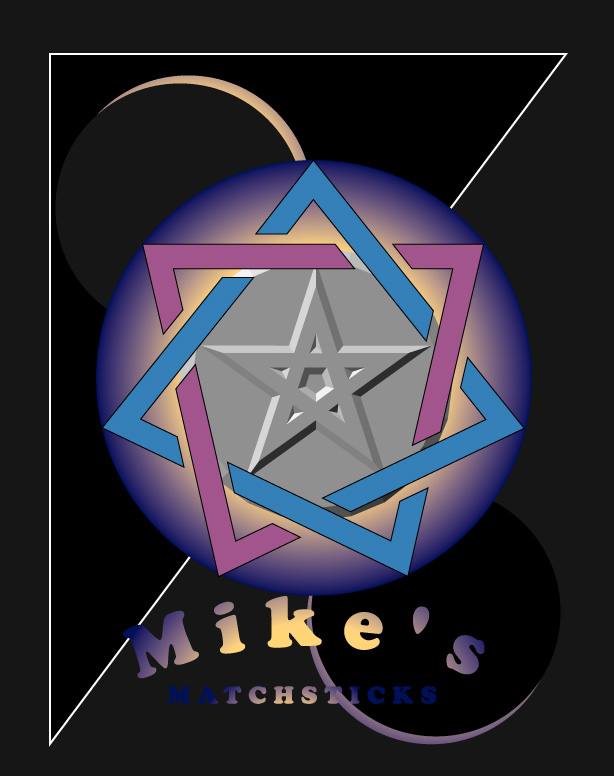 |
Another matchbox cover made in Illustrator. I basically copied an existing cover, albeit making some alterations, like the huge graphic in the middle. By the way, that graphic isn't supposed to look satanic or anything weird like that. |